


Those of you using CS Photoshop will find a new adjustment -- the Shadow/Highlight. It is an improvement on Brightening/Contrast as it gives greater leeway. First you need a suitable photo. You can download the one I will be using here.
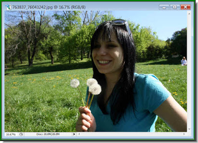 Step 1 : I have opened this photo in Photoshop. You see that the shadows ruin the photo. It may easily happen.
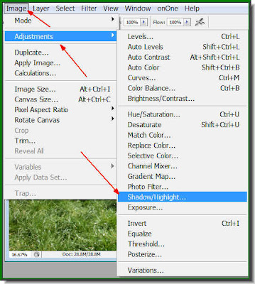 Step 2 : Go to Image>Adjustments>Shadow/Highlights
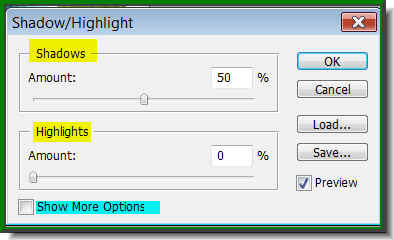 Step 3 : This dialogue box opens. These are the default settings shown. Check the Show More Options.
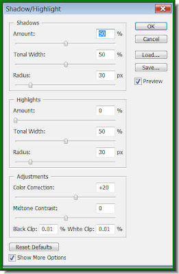 Step 4 : The full settings are now visible. The settings shown are the default ones. Let us have a look at the photo with the default settings.
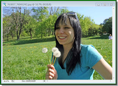 There has been a dramatic improvement in the image. The shadows on the girl's face have gone away. The default settings, however, might not work all the time. Let us study what the settings actually do. But remember one thing. The settings are for this photo only. Each photo is unique and will require different settings. Once you know how they work, you will be able to apply them too.
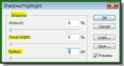 Step 5 : Move all the sliders to zero.
 The shadows have reappeared.
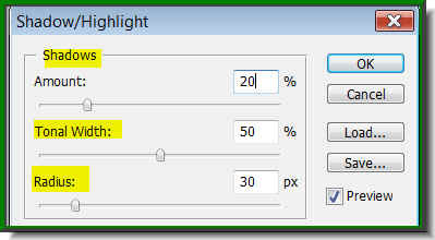 Step 6 : I have changed the Shadows to 20% instead of the default 50 %, while leaving the Tonal Width and Radius to 50 % and 30 pixels.
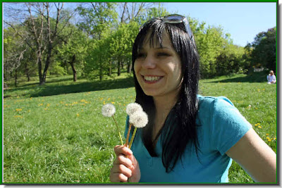 The Photo looks much better. The first lesson is therefore first to experiment with Shadows, Tonal Width and Radius.
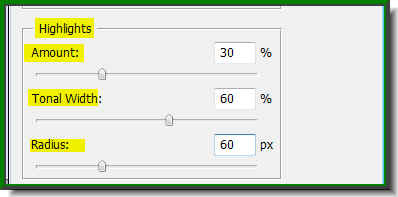 Step 7 : Now I have changed the settings for Highlights. I have dragged the Amount slider to 30 % instead of leaving it at the default zero. The sky has become more blue. I have increased the Tonal Width to 60 % and increased the Radius to 60 pixel.
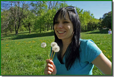
The Blue have brightened and the green of the grass is darker now. This is how the tweak works.
 Step 8 : In Adjustments, I have increased the Color Correction to +40 from the deafult and increased the Midtone Contrast +5. You will be able to see the changes as you drag the sliders in the three sections one by one. There is no hard and fast rule for the settings. First give the default settings, then finetune them gradually.
 This is how my finished image looks. If you are using the same image, you will get the same result. Remember that each image will require different settings. Give the tweaks in the three sections, one by one. And, you will get dramatic results. That is all.
Other Photoshop tutorials are here.

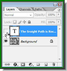
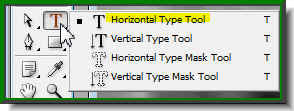 Step 5 : Click the Text Tool and then the Horizontal Type Tool.
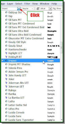 Step 6 : Click where the arrow points to, to reveal the list of fonts available in your version of Photoshop. Click on Impact. It is found in all versions of Photoshop.
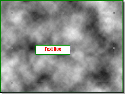 Step 7 : Draw out the Text Box by dragging with Type Tool.
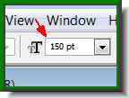 Step 8 : You can set the size of the Font from this box. Just enter the value. You can get an idea how big your letters from the blinking cursor in the Text box.
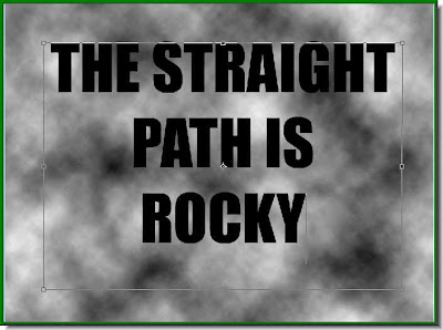 Step 9 : I have typed out my Text.
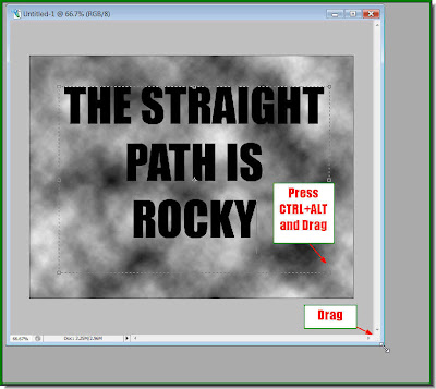
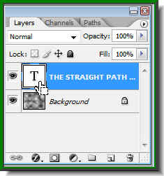
 Step 13 : Click off the eye icon on Text layer.
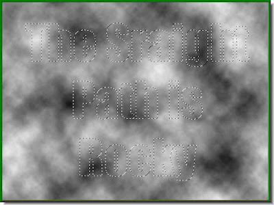 Only the selection remains, while Text has disappeared because you have switched off the eye icon in the Text layer.
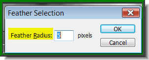 Step 14 : Press ALT+CTRL+D. This will bring up the Feather dialogue box. I have put a Feather radius of 5 pixels. Click ok.
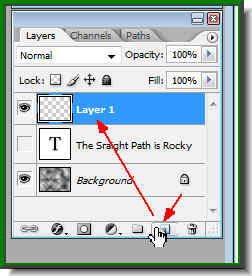 Step 15 : Click the Add New Layer button and new Layer forms above the Text layer.
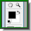
 Step 16 : Click the small bent arrow over the Foreground and Background color to change the Foreground to White.
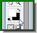 Step 17 : Now click the Background Color which is now Black. Click the Background Color.
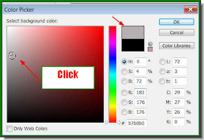 Step 18 : This will open the Color Picker. Now click on a Grey shade in the left panel. Notice that little box at top which is divided into two colors. The top half changes to the color you pick.
 This is how the Foreground and Background Color looks like.
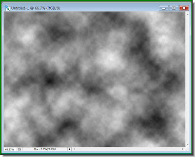
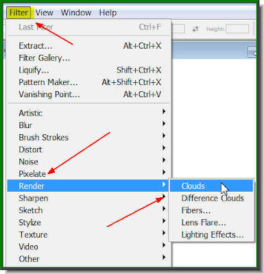 Step 19 : Go to Filter>Render>Clouds.
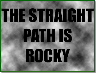
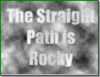 Step 20 : This is how the Text looks. Press CTRL+D to deselect and the selection goes away.
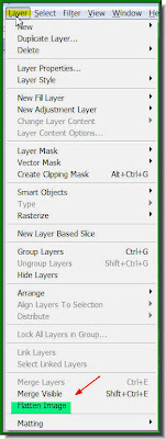 Step 21 : Go to Layers>Flatten Image.
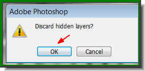 Step 22 : This dialogue box opens. Click ok.
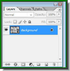 All the Layers have been reduced to the Background layer.
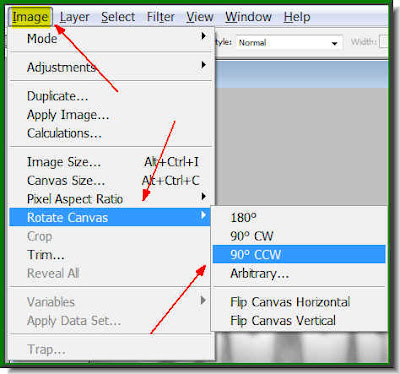
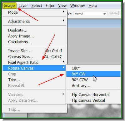 Step 23 : Go to Image>Rotate Image>90 CW
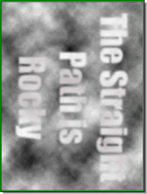 The image rotates.
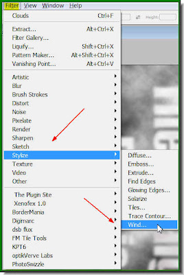 Step 24 : Go to Filter>Stylize>Wind.
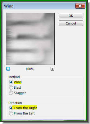 Step 25 : The Wind dialogue box opens. Just click ok. I have left it at the default settings.
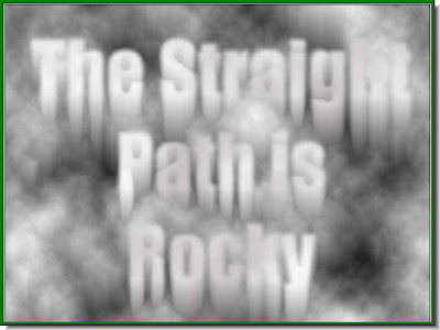
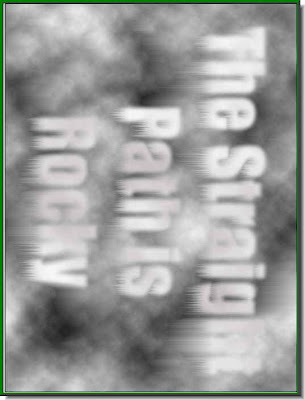 Step 26 : This is how the image looks. Now press CTRL+F five to six times.
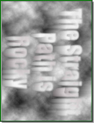
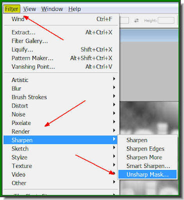 Step 28 : Go to Filter>Sharpen>Unsharp Mask.
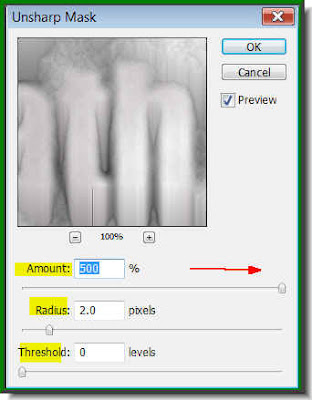 Step 29 : The Unsharp dialogue box opens. Keep the Threshold at 0, the Radius at 2.0 and the Amount to the maximum. Click ok.
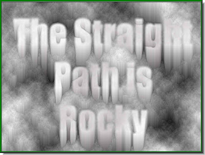 Step 30 : This is how the image looks. Press CTRL+F once.
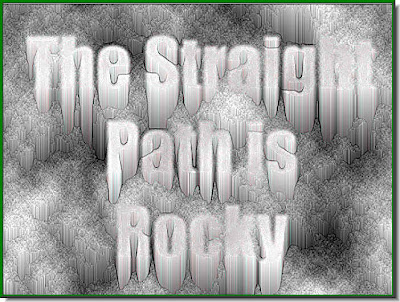
 Step 31 : Press CTRL+U. The Hue/Saturation box opens. Check Colorize. Now drag the Hue slider to the right or left and the image will change color as you drag the slider. Click ok when you are satisfied.
 This is the color I liked. That is all. It's very easy, don't you think?


