Sometimes you may want to bring the focus in an image to a particular spot. You can do this with a couple of Adjustment Layers. It is not difficult to do at all and will work with any image. Moreover it does not take much time.

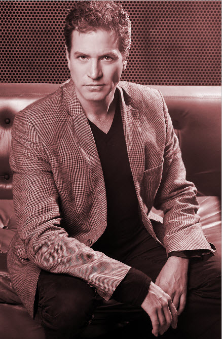
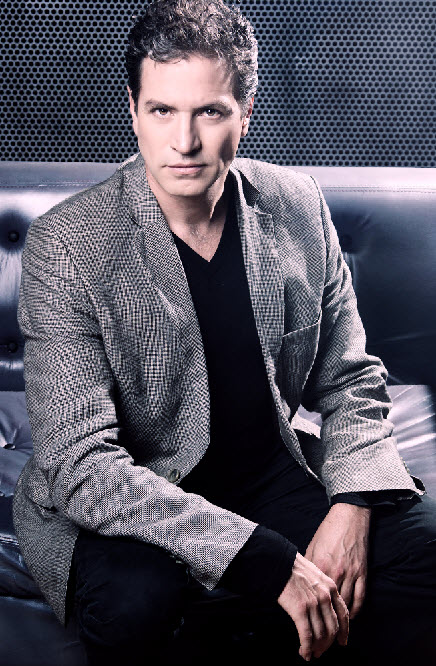
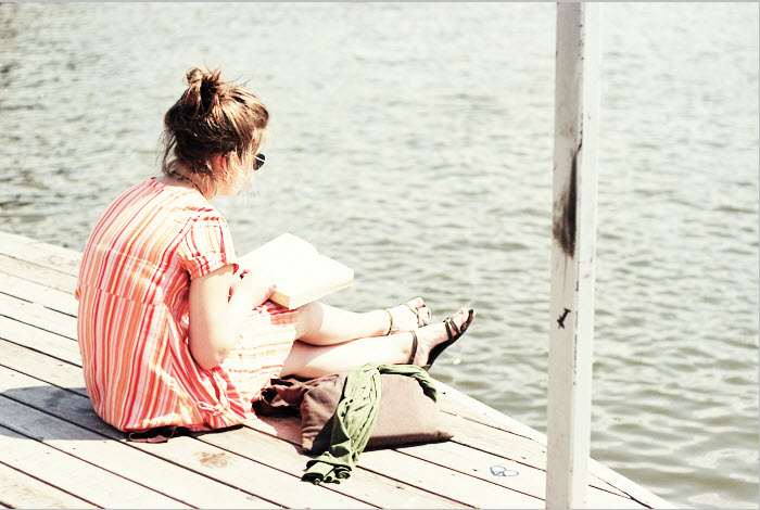
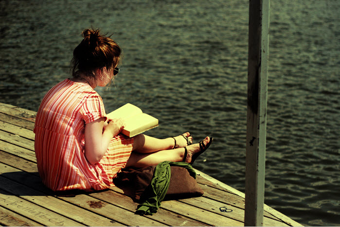
This is the effect I am aiming for. The original image is just below.
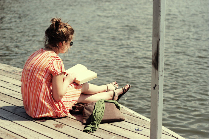
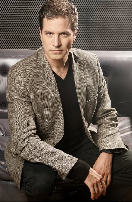
Step 1 : I have opened this free stock image which you will find here
It belongs to
You can see that the image is very brightly lit. If I have to bring the focus on the girl, I will have to ensure that the background does not distract. But the background is equally brilliantly lit.
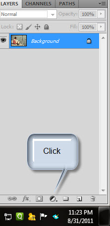
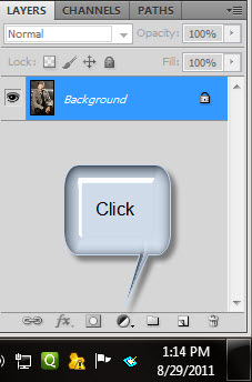
Step 2 : Click the New Fill or Adjustment Layer button.
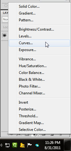
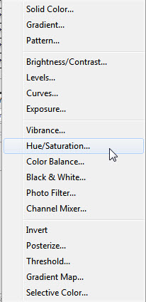
Step 3 : Click on Curves from the pop up.

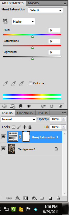
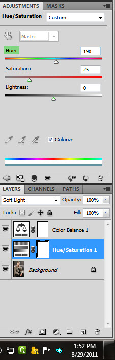
Step 4 : The Curves 1 Layer opens above the Background. The Curves dialogue box is on top. It is at the default setting.

Step 5 : In the Curves dialogue box click the middle of the diagonal and drag up diagonally.
The image becomes even more bright after you pull up the diagonal.

Step 6 : Press CTRL+I to invert the Layer Mask to Black.

You see the original image again.
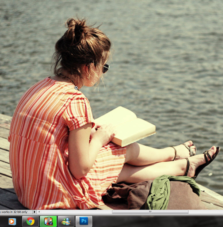
Step 7 : Zoom into the image with the Zoom Tool.

Step 8 : Click the Brush Tool.
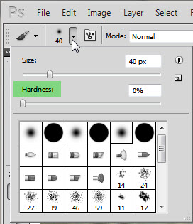
Step 9 : Click in the top panel to reveal the Brush controls. Set the Hardness slider at 0. Instead of using the Size slider to increase or decrease the size of the Brush press SHIFT+] to increase the size of the Brush and SHIFT+[ to decrease it.
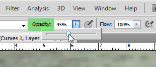
Step 10 : In the top panel lower the Opacity of the Brush to 45 to 50%.
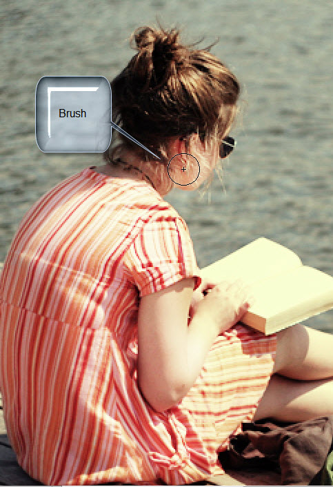
Step 11 : With Brush set to low Opacity I have painted on the face, the back and arms.
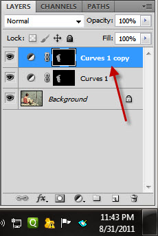
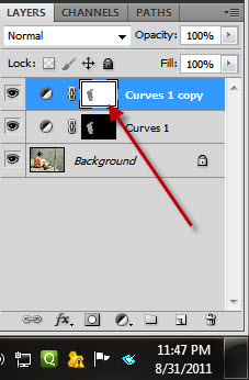
Step 12 : Press CTRL+J to duplicate Curves 1 layer to Curves 1 copy layer.
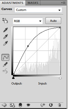
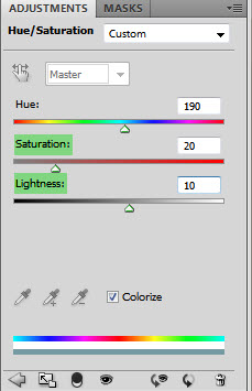
This was the last position of the Curves dialogue box.
Step 13 : Press CTRL+I to inverse the Mask to White. The image will instantly increase in brightness.
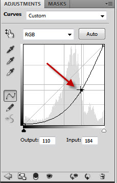
Step 14 : Drag the midpoint of the diagonal down in a curve.

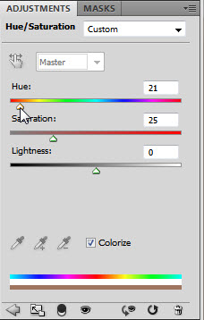
The remainder of the image darkens.
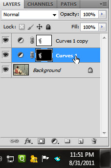
Step 15 : Click back on the Curves 1 Layer.
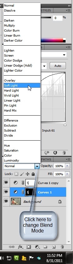
Step 16 : Change the Blend Mode of the Layer to Soft light.

Step 17 : Click on Masks. See the arrow on top.
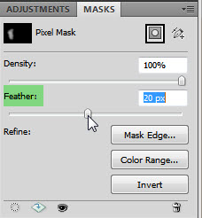
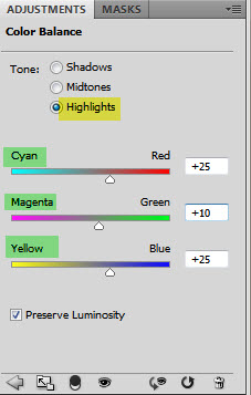
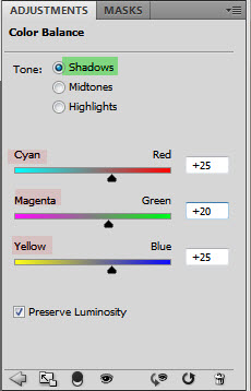
Step 18 : Look at your image and drag the Feather Radius to taste. I have dragged it to 20 pixels.
The image looks like this. Just some minor adjustments are left.
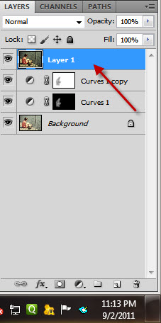 Step 19 : Press CTRL+SHIFT+ALT+E. A composite Layer 1 forms.
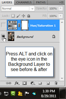
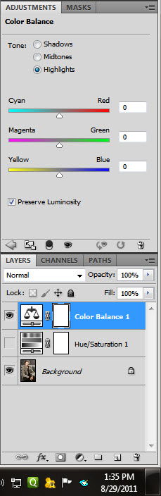
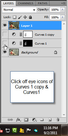 Step 20 : Click off the eye icons of Curves1 copy and Curves 1 layers. This is to guard against color shift occurring.
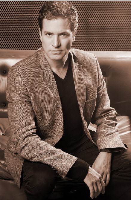
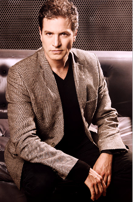
 The finished image.
Other tutorials are here
IF you have a photoshop question or wish for a photoshop tutorial please emal me at pradip.chowdhury@gmail.com